pastetaste
Widget Frame
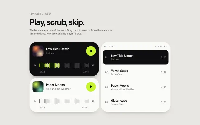
Shell for small instrument widgets: a rounded tile in 1×1, 2×1 or 2×2 cells, four tones, an optional mono label row with a [count] and like toggle, and a dot-grid ground. Scales from one cell token.
Paste it into Claude Code: it installs the component, asks for your brand and content, and places it on the page you name.
Live demo. Move the mouse and scroll inside it.
Install
Or by hand, in a Next.js project with shadcn set up. It writes components/pastetaste/widget-frame.tsx.
npx shadcn@latest add https://pastetaste.com/r/widget-frame.jsonPrompt
Install the pastetaste component "Widget Frame" (widget-frame) into this Next.js project and use it.

What it is: Shell for small instrument widgets: a rounded tile in 1×1, 2×1 or 2×2 cells, four tones, an optional mono label row with a [count] and like toggle, and a dot-grid ground. Scales from one cell token.

Before you place it, ask me (one short message, in my language; "skip" = sensible default): which page and section it goes in, my brand colour (hex), the text, labels or images it should show, and whether I want my logo or my own copy in the demo content. Then:

Steps:
1. If the project has no components.json, run: npx shadcn@latest init -y -d. Then run: npx shadcn@latest add https://pastetaste.com/r/widget-frame.json
   (it writes components/pastetaste/widget-frame.tsx; install any npm packages it reports).
2. Import it: import { WidgetFrame } from "@/components/pastetaste/widget-frame" (check the file for the exact named export).
3. Put it where it fits on the page I name, keep the rest of the page untouched, and pass props for my colours instead of editing the installed file.
4. It does not depend on Tailwind; colours come from CSS variables (--pt-*) or props.
5. It supports prefers-reduced-motion with a still state; do not remove it.

Props (all optional unless the type has no default):
- size: '1x1' | '2x1' | '2x2' = '1x1' — Footprint of a tile in grid cells. Plates ignore it and fill their container.
- variant: 'tile' | 'plate' = 'tile' — A tile is the widget object; a plate is a listing card (paper tone) that holds one.
- tone: 'dark' | 'light' | 'accent' | 'paper' = 'dark' (tile), 'paper' (plate) — Surface colour. Children read --w-fg, --w-muted, --w-line, --w-ghost and --w-accent from it.
- accent: string = var(--pt-widget-accent, var(--pt-accent, #c6f432)) — The one accent colour; also the fill of the accent tone.
- label: ReactNode — Mono label in the top row. Setting a label (or count, or like) turns the row on.
- count: number | string — Small count shown as [4.4K]. Numbers are abbreviated and move by one when the like toggles.
- like: boolean = false — Show the like toggle (a button with aria-pressed).
- liked / defaultLiked / onLikedChange: boolean / boolean / (liked: boolean) => void = false — Controlled or uncontrolled like state.
- ground: 'none' | 'dots' = 'none' — Faint dot grid behind the content, fading toward the edges.
- footer: ReactNode — Bottom row in mono caps, e.g. an author line.
- padding / radius: number | string = 1.5em / --pt-widget-radius — Inner padding and corner radius; numbers are px.
- as: 'div' | 'section' | 'article' | 'li' = 'div' — Element to render.

Live preview: https://pastetaste.com/c/widget-frame
Then run the dev server, check it in the browser at desktop and mobile width, and tell me the page URL.
Props 12
| Prop | Type | Default | Description |
|---|---|---|---|
| size | '1x1' | '2x1' | '2x2' | '1x1' | Footprint of a tile in grid cells. Plates ignore it and fill their container. |
| variant | 'tile' | 'plate' | 'tile' | A tile is the widget object; a plate is a listing card (paper tone) that holds one. |
| tone | 'dark' | 'light' | 'accent' | 'paper' | 'dark' (tile), 'paper' (plate) | Surface colour. Children read --w-fg, --w-muted, --w-line, --w-ghost and --w-accent from it. |
| accent | string | var(--pt-widget-accent, var(--pt-accent, #c6f432)) | The one accent colour; also the fill of the accent tone. |
| label | ReactNode | - | Mono label in the top row. Setting a label (or count, or like) turns the row on. |
| count | number | string | - | Small count shown as [4.4K]. Numbers are abbreviated and move by one when the like toggles. |
| like | boolean | false | Show the like toggle (a button with aria-pressed). |
| liked / defaultLiked / onLikedChange | boolean / boolean / (liked: boolean) => void | false | Controlled or uncontrolled like state. |
| ground | 'none' | 'dots' | 'none' | Faint dot grid behind the content, fading toward the edges. |
| footer | ReactNode | - | Bottom row in mono caps, e.g. an author line. |
| padding / radius | number | string | 1.5em / --pt-widget-radius | Inner padding and corner radius; numbers are px. |
| as | 'div' | 'section' | 'article' | 'li' | 'div' | Element to render. |