pastetaste
Flyout Tabs
NavigationInteractionAnimation
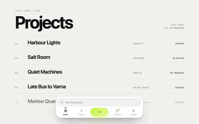
Pill tab bar over one shared panel: the pill slides between tabs, contents hand over with a blur-out, a beat and a staggered rise, and list highlights glide between rows. Tabs or a nav menu.
Paste it into Claude Code: it installs the component, asks for your brand and content, and places it on the page you name.
Live demo. Move the mouse and scroll inside it.
Install
Or by hand, in a Next.js project with shadcn set up. It writes components/pastetaste/flyout-tabs.tsx.
npx shadcn@latest add https://pastetaste.com/r/flyout-tabs.jsonPrompt
Install the pastetaste component "Flyout Tabs" (flyout-tabs) into this Next.js project and use it.

What it is: Pill tab bar over one shared panel: the pill slides between tabs, contents hand over with a blur-out, a beat and a staggered rise, and list highlights glide between rows. Tabs or a nav menu.

Before you place it, ask me (one short message, in my language; "skip" = sensible default): which page and section it goes in, my brand colour (hex), the text, labels or images it should show, and whether I want my logo or my own copy in the demo content. Then:

Steps:
1. If the project has no components.json, run: npx shadcn@latest init -y -d. Then run: npx shadcn@latest add https://pastetaste.com/r/flyout-tabs.json
   (it writes components/pastetaste/flyout-tabs.tsx; install any npm packages it reports).
2. Import it: import { FlyoutTabs } from "@/components/pastetaste/flyout-tabs" (check the file for the exact named export).
3. Put it where it fits on the page I name, keep the rest of the page untouched, and pass props for my colours instead of editing the installed file.
4. It does not depend on Tailwind; colours come from CSS variables (--pt-*) or props.
5. It supports prefers-reduced-motion with a still state; do not remove it.

Props (all optional unless the type has no default):
- tabs: { id: string; label: string; content: ReactNode }[] — Tabs in order. Each top-level child of content rises in turn when the tab opens; a FlyoutList rises row by row.
- value / defaultValue / onValueChange: string / string / (id: string) => void = first tab — Controlled or uncontrolled active tab.
- collapsible: boolean = false — Menu mode: a nav whose panel opens under the bar and closes on Escape, an outside click, focus leaving or (with trigger hover) the pointer leaving. Off: WAI-ARIA tabs with the panel always shown.
- defaultOpen: boolean = false — Collapsible only: start with the panel open.
- trigger: 'click' | 'hover' = 'click' — Hover also switches (and opens) a tab after the mouse rests on it for 90 ms. Clicks, taps and keys always work.
- tone: 'paper' | 'ink' = 'paper' — Solid white or near-black surfaces.
- accent / accentText: string / string = var(--pt-accent, #ff5b2e) / '#17140f' — Pill colour and the label colour on it.
- width: number | string = 360 — Width of bar and panel (number = px); never wider than the parent. Tabs share the bar, so longer labels get longer pills.
- speed: number = 1 — Multiplies every duration's speed (2 = twice as fast).
- label: string = 'Sections' — Accessible name of the tab list or nav.
- FlyoutList: title / items / label: string / { label; href?; onSelect?; meta? }[] / string — Link list for a pane: mono overline, rows as anchors (href) or buttons, optional meta text on the right that steps aside for the arrow.

Live preview: https://pastetaste.com/c/flyout-tabs
Then run the dev server, check it in the browser at desktop and mobile width, and tell me the page URL.
Props 11
| Prop | Type | Default | Description |
|---|---|---|---|
| tabs | { id: string; label: string; content: ReactNode }[] | - | Tabs in order. Each top-level child of content rises in turn when the tab opens; a FlyoutList rises row by row. |
| value / defaultValue / onValueChange | string / string / (id: string) => void | first tab | Controlled or uncontrolled active tab. |
| collapsible | boolean | false | Menu mode: a nav whose panel opens under the bar and closes on Escape, an outside click, focus leaving or (with trigger hover) the pointer leaving. Off: WAI-ARIA tabs with the panel always shown. |
| defaultOpen | boolean | false | Collapsible only: start with the panel open. |
| trigger | 'click' | 'hover' | 'click' | Hover also switches (and opens) a tab after the mouse rests on it for 90 ms. Clicks, taps and keys always work. |
| tone | 'paper' | 'ink' | 'paper' | Solid white or near-black surfaces. |
| accent / accentText | string / string | var(--pt-accent, #ff5b2e) / '#17140f' | Pill colour and the label colour on it. |
| width | number | string | 360 | Width of bar and panel (number = px); never wider than the parent. Tabs share the bar, so longer labels get longer pills. |
| speed | number | 1 | Multiplies every duration's speed (2 = twice as fast). |
| label | string | 'Sections' | Accessible name of the tab list or nav. |
| FlyoutList: title / items / label | string / { label; href?; onSelect?; meta? }[] / string | - | Link list for a pane: mono overline, rows as anchors (href) or buttons, optional meta text on the right that steps aside for the arrow. |