pastetaste
Compose Dock
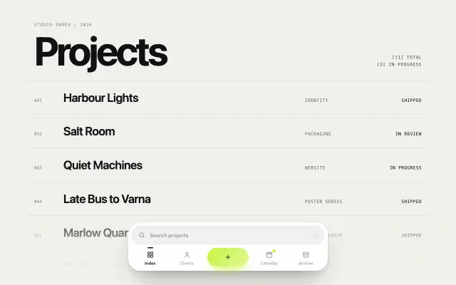
Floating search-and-tabs dock whose plus pill turns the same card into a composer: tabs slide in under the pill, create kinds slide out, the field becomes the prompt and the pill goes from cross to verb to check.
Paste it into Claude Code: it installs the component, asks for your brand and content, and places it on the page you name.
Live demo. Move the mouse and scroll inside it.
Install
Or by hand, in a Next.js project with shadcn set up. It writes components/pastetaste/compose-dock.tsx.
npx shadcn@latest add https://pastetaste.com/r/compose-dock.jsonPrompt
Install the pastetaste component "Compose Dock" (compose-dock) into this Next.js project and use it.

What it is: Floating search-and-tabs dock whose plus pill turns the same card into a composer: tabs slide in under the pill, create kinds slide out, the field becomes the prompt and the pill goes from cross to verb to check.

Before you place it, ask me (one short message, in my language; "skip" = sensible default): which page and section it goes in, my brand colour (hex), the text, labels or images it should show, and whether I want my logo or my own copy in the demo content. Then:

Steps:
1. If the project has no components.json, run: npx shadcn@latest init -y -d. Then run: npx shadcn@latest add https://pastetaste.com/r/compose-dock.json
   (it writes components/pastetaste/compose-dock.tsx; install any npm packages it reports).
2. Import it: import { ComposeDock } from "@/components/pastetaste/compose-dock" (check the file for the exact named export).
3. Put it where it fits on the page I name, keep the rest of the page untouched, and pass props for my colours instead of editing the installed file.
4. It does not depend on Tailwind; colours come from CSS variables (--pt-*) or props.
5. It supports prefers-reduced-motion with a still state; do not remove it.

Props (all optional unless the type has no default):
- tabs: { id: string; label: string; icon: ReactNode; activeIcon?: ReactNode; href?: string; badge?: boolean | number }[] — Destinations. The pill sits after the first half, so pass an even number (four reads best).
- kinds: { id: string; label: string; icon: ReactNode; placeholder?: string; verb?: string; sent?: string }[] — What the plus creates. They replace the tabs while the composer is open; each sets the field prompt, the pill verb and the message after a send.
- onCreate: ({ kind, text }) => void | boolean | Promise<void | boolean> — Runs on Enter or the pill. Return false, throw or reject to keep the draft; a promise shows a spinner in the pill until it settles.
- value / defaultValue / onChange: string / string / (id, tab) => void = tabs[0].id — Active tab, controlled or not.
- query / defaultQuery / onQueryChange / onSearch: string / string / (q) => void / (q) => void = '' — Search text, controlled or not, and Enter in the search field.
- open / defaultOpen / onOpenChange: boolean / boolean / (open) => void = false — Composer state, for opening it from elsewhere (e.g. a menu item).
- kind / defaultKind / onKindChange: string / string / (id) => void = kinds[0].id — Chosen kind, controlled or not.
- draft / defaultDraft / onDraftChange: string / string / (text) => void = '' — Composer text, controlled or not, e.g. to restore an unsent draft or type into it from your own UI.
- placeholder: string = 'Search' — Search prompt; also the accessible name of the field while browsing.
- maxLength: number = 280 — Longest draft; a countdown shows in the field for the last 40 characters.
- confirmFor: number = 900 — Milliseconds the check mark and sent message stay before the card plays back to the tabs.
- tone: 'paper' | 'ink' = 'paper' — Light card with a white rim, or a dark card.
- accent: string = var(--pt-accent, #ff8a3d) — Pill, badges and focus halo. Black or white glyphs are picked automatically for hex colours.
- label / kindsLabel / createLabel / closeLabel: string = 'Primary' / 'Create' / 'Create' / 'Close composer' — Accessible names of the navigation, the kind radio group and the pill in its two toggle states.
- shortcut: boolean = true — Press / anywhere outside a field to focus the search while browsing.

Live preview: https://pastetaste.com/c/compose-dock
Then run the dev server, check it in the browser at desktop and mobile width, and tell me the page URL.
Props 15
| Prop | Type | Default | Description |
|---|---|---|---|
| tabs | { id: string; label: string; icon: ReactNode; activeIcon?: ReactNode; href?: string; badge?: boolean | number }[] | - | Destinations. The pill sits after the first half, so pass an even number (four reads best). |
| kinds | { id: string; label: string; icon: ReactNode; placeholder?: string; verb?: string; sent?: string }[] | - | What the plus creates. They replace the tabs while the composer is open; each sets the field prompt, the pill verb and the message after a send. |
| onCreate | ({ kind, text }) => void | boolean | Promise<void | boolean> | - | Runs on Enter or the pill. Return false, throw or reject to keep the draft; a promise shows a spinner in the pill until it settles. |
| value / defaultValue / onChange | string / string / (id, tab) => void | tabs[0].id | Active tab, controlled or not. |
| query / defaultQuery / onQueryChange / onSearch | string / string / (q) => void / (q) => void | '' | Search text, controlled or not, and Enter in the search field. |
| open / defaultOpen / onOpenChange | boolean / boolean / (open) => void | false | Composer state, for opening it from elsewhere (e.g. a menu item). |
| kind / defaultKind / onKindChange | string / string / (id) => void | kinds[0].id | Chosen kind, controlled or not. |
| draft / defaultDraft / onDraftChange | string / string / (text) => void | '' | Composer text, controlled or not, e.g. to restore an unsent draft or type into it from your own UI. |
| placeholder | string | 'Search' | Search prompt; also the accessible name of the field while browsing. |
| maxLength | number | 280 | Longest draft; a countdown shows in the field for the last 40 characters. |
| confirmFor | number | 900 | Milliseconds the check mark and sent message stay before the card plays back to the tabs. |
| tone | 'paper' | 'ink' | 'paper' | Light card with a white rim, or a dark card. |
| accent | string | var(--pt-accent, #ff8a3d) | Pill, badges and focus halo. Black or white glyphs are picked automatically for hex colours. |
| label / kindsLabel / createLabel / closeLabel | string | 'Primary' / 'Create' / 'Create' / 'Close composer' | Accessible names of the navigation, the kind radio group and the pill in its two toggle states. |
| shortcut | boolean | true | Press / anywhere outside a field to focus the search while browsing. |